Nous aidons les entreprises à transformer leur activité physique en digitale et à maximiser leur succès.
Color palette and typography for a coherent visual identity
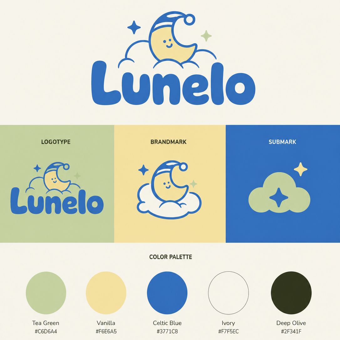
Colors and typography play an essential role in building your visual identity and shaping how your brand is perceived.
At E-TRANSFORMATION, we define graphic choices adapted to your positioning to strengthen your brand image, improve visual consistency, and ensure clear communication across all your media.
Communication agency
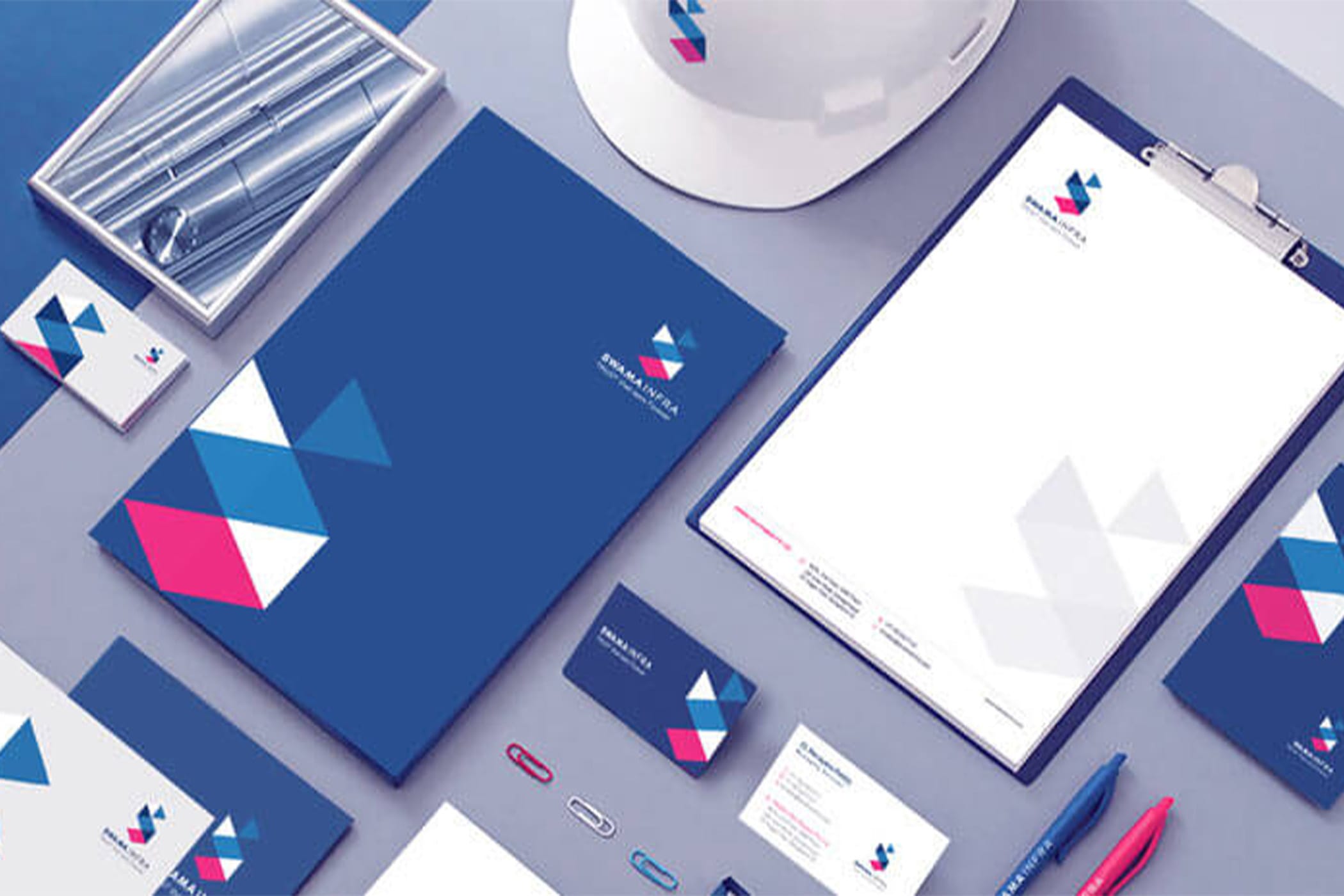
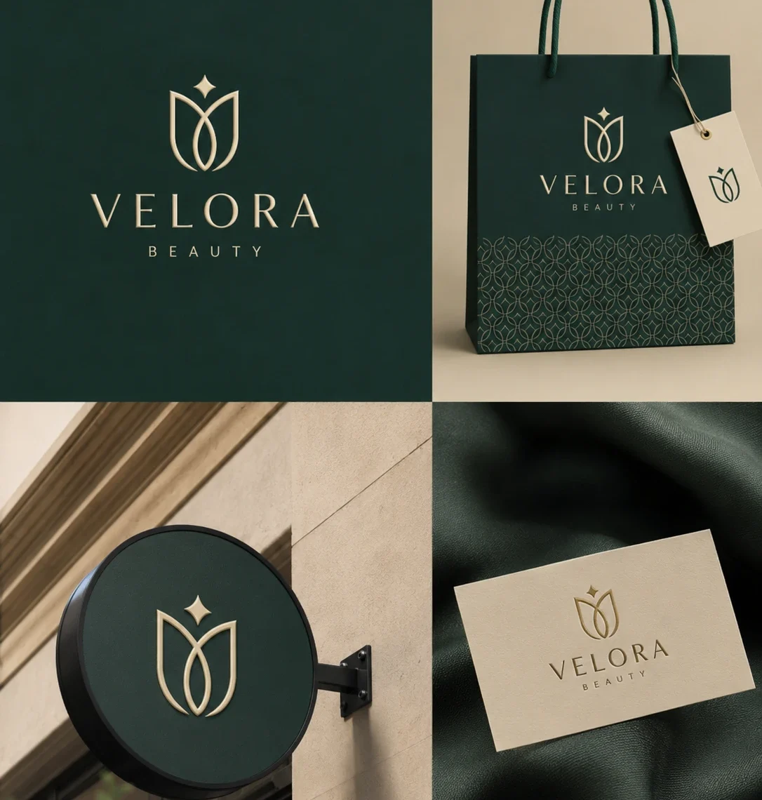
Visual choices that strengthen your brand image
Colors and typography directly influence how your brand and company are perceived by your clients. A coherent selection helps communicate a clear message, strengthen your visual identity, and support your positioning within a digital marketing strategy as a communication agency.
- improve visual recognition
- structure your brand image
- create consistency across all media
- strengthen your communication
Digital marketing agency
A selection aligned with your visual identity
As a communication agency and digital marketing agency, we define color palettes and typography choices adapted to your positioning and brand image. Each element is designed to ensure visual consistency, strengthen your visual identity, and guarantee clear, homogeneous communication across all your media.
- coherent color choices
- readable and adapted typography
- overall visual harmony
- visual identity-oriented approach
visual identity-oriented approach
Structure your visual identity
with coherent graphic elements
A well-defined color palette and typography help strengthen your visual identity and ensure homogeneous communication across all your media. These elements play a key role in your digital transformation by structuring your brand image and making your communication more coherent across all channels.
Color palette
We define a color palette adapted to your brand image, your positioning, and your visual direction. Each color is chosen to strengthen your visual identity, improve brand recognition, and create a coherent impression.
Adapted typography
We select typography that is coherent with your visual identity to ensure clear, professional, and pleasant reading. A good typographic choice strengthens your brand image, improves readability, and supports your communication.